Usage
Using color
Our color palette is designed to work across all digital properties, from websites to applications to ads and more. To view our colors as design tokens, go to the Tokens section. If you have questions about how to apply the color palette, contact us.
Brand red
Our primary brand color is red. It is important to use it consistently and thoughtfully to maximize accessibility and build brand recognition. Red is a strong color; use it as an accent instead of filling large areas. If you need a color for danger or error states, use red-orange. To learn more about our Red Hat red color, go to the Brand standards website.
Usage Warning
Do not apply the Red Hat red color to text in dark environments unless it meets WCAG 2.1 AA requirements.

Canvas
A canvas is a background color and it determines what theme is used. The default canvas colors are white and black, but there might be situations where grays or even custom colors are needed. It is acceptable to use other colors as long as contrast is maintained throughout the entire design. If a custom canvas color is lighter or darker than the defaults, white or black may be used as surface colors.

Surface
A surface is a container background color that sits on top of a canvas. Surface colors are used as backgrounds for elements, patterns, and large sections. For example, a card (white surface) can be placed in a section (light gray surface) on a canvas (white).
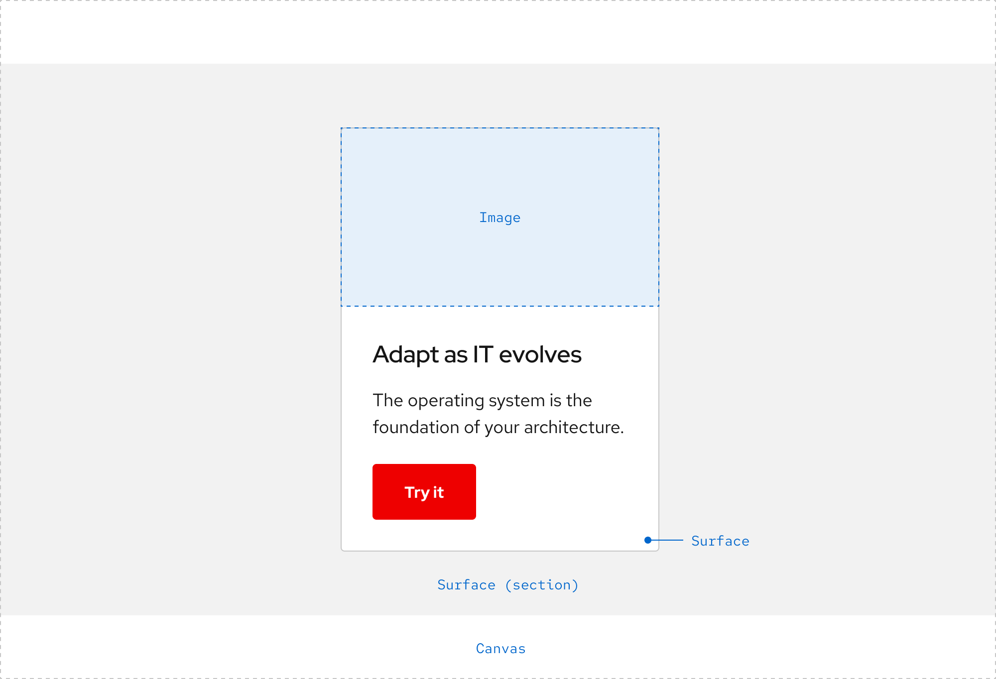
Layering Beta
Layering is the relationship between the canvas color and surface colors as well as how they stack to create depth and separate content.
Update from the team
The design system team is working on creating best practices for layering in the near future. Contact us if you would like to contribute.
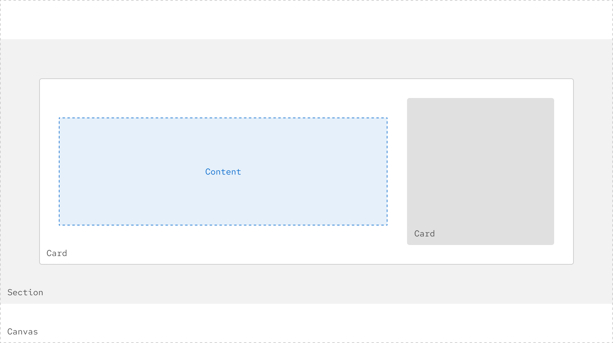
Light theme
In the light theme, white and gray values alternate when stacked.
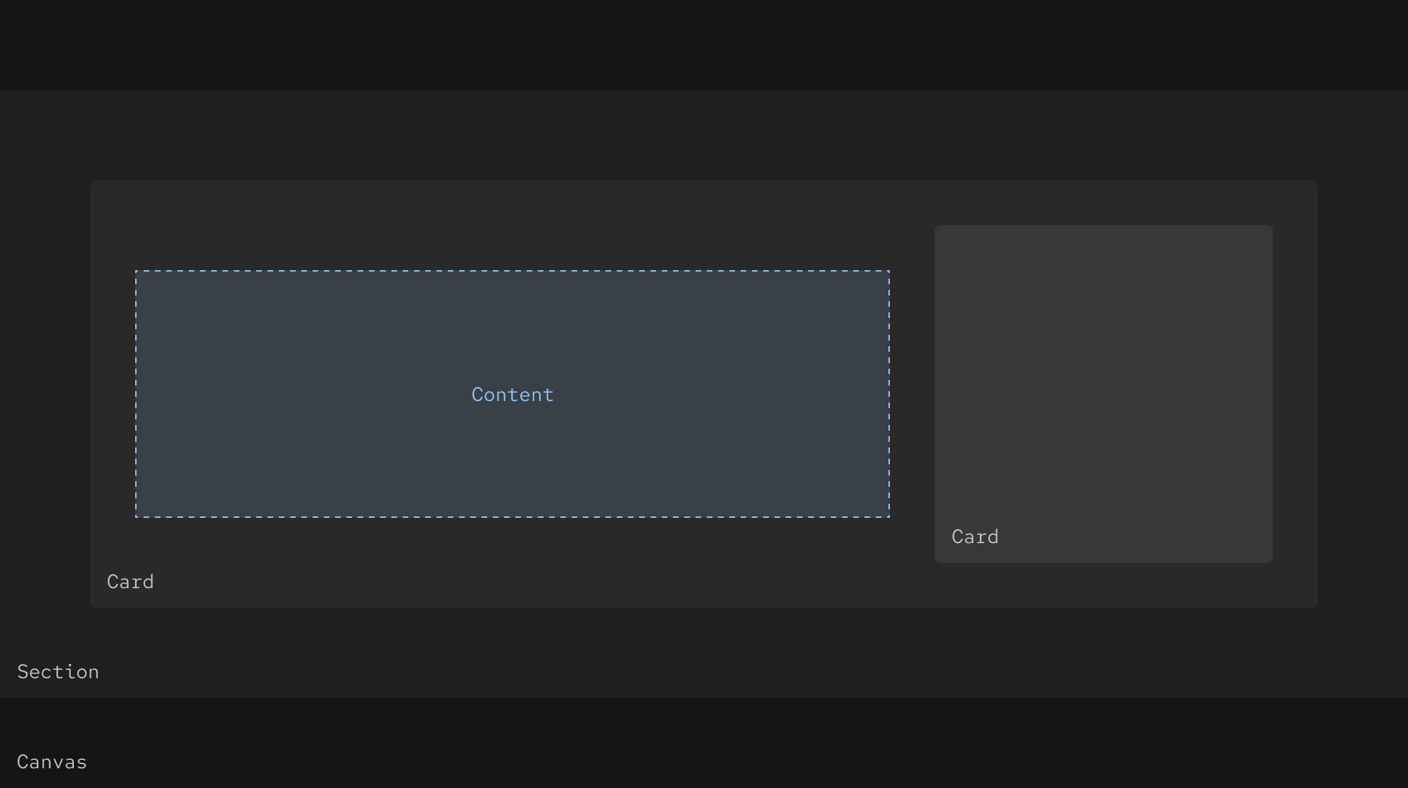
Dark theme
In the dark theme, gray values should get one step lighter when stacked.
Text
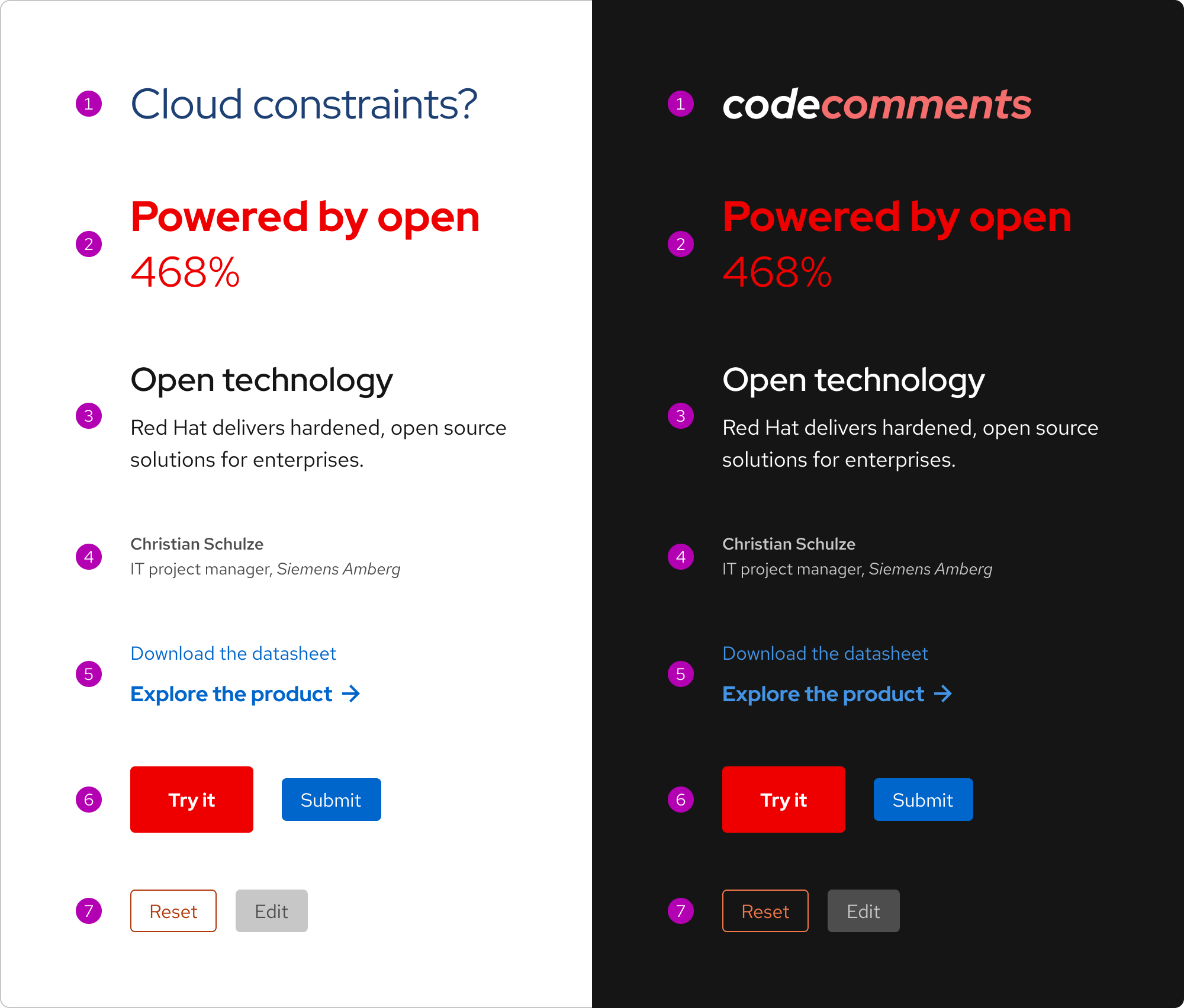
Text may be different colors depending on content, hierarchy, and theme. Our accessible colors help promote text legibility and readability. These are general usage guidelines; there may be other situations not represented.
- Custom - use to represent a temporary campaign or custom design
- Brand - use to communicate our brand or add a brand accent
- Primary - use for large text including headlines and body text as well as small link text in dark environments (white)
- Secondary - use for small text including annotations, captions, and footnotes
- Links - use for small or large text that is linked
- Interactive - use for styled text within calls to action, buttons, or other interactive elements
- Status - use for text that needs to communicate a particular status
Usage Warning
Do not apply the Red Hat red color to text in dark environments unless it meets WCAG 2.1 AA requirements.
Icons
Icons may be different colors depending on usage and theme. There are three categories of icons: Brand, Technology, and UI.
- Brand - monochromatic and usually red, black, or white
- Technology - always black, gray, red, and white
- UI - may be different colors depending on how they are used within an element or pattern
To learn more about icons, go to the Brand standards website.
Interactivity
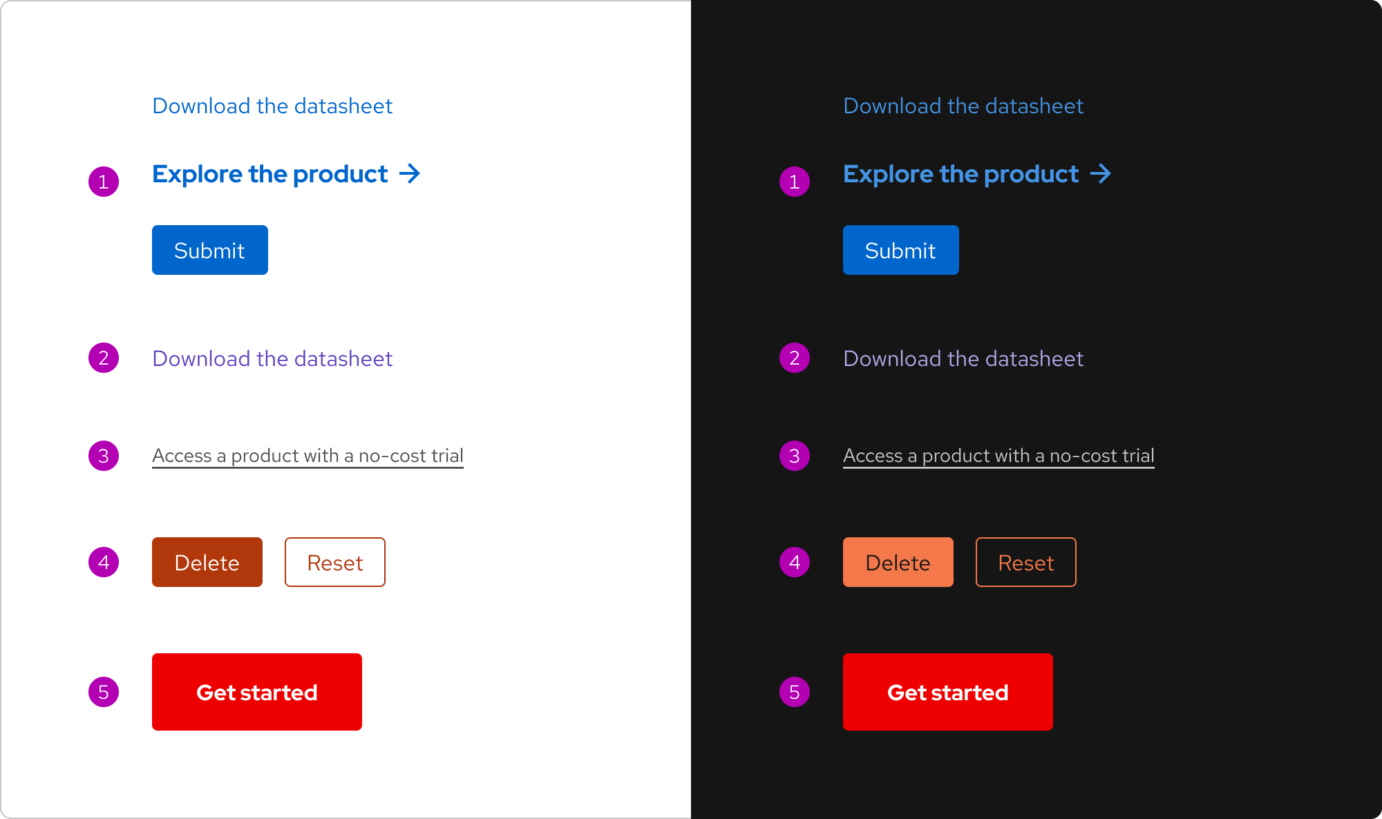
Certain colors are used to indicate that something is interactive.
- Blue - use for inline links, Default calls to action, or Primary button surfaces
- Purple - use for visited inline links
- Gray - use for secondary or small links (using white is also acceptable in dark environments)
- Red-orange - use for destructive actions (and errors)
- Red - use sparingly for Primary calls to action only
Status
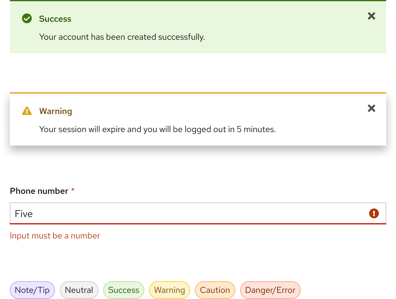
Status colors have assigned meanings and communicate information, states, or actions. Status colors are commonly used in elements and patterns like alerts, badges, buttons, forms, and toasts.
Usage Warning
The red-orange color is reserved for danger or error states, do not use it anywhere else.
| Status | Use case |
|---|---|
| Note/Tip | Use purple to communicate helpful or important information. |
| Neutral | Use gray to communicate information that will have no impact on a user. |
| Success | Use green to communicate a success state. |
| Caution | Use yellow to communicate that an issue can be avoided. |
| Warning | Use orange to communicate that a destructive action might occur if an issue is not resolved. |
| Danger/Error | Use red-orange to communicate a destructive action or critical error. |
Best practices
The design system's guidelines and best practices are more than just suggestions. By following them scrupulously, you will ensure that your project aligns with branding and accessibility guidelines. Diverge from the guidelines only after significant planning and consideration.
Custom themes
Most projects do not need elements and patterns in a custom theme. If you need a custom theme for a campaign or special project, contact the Brand team first. If you need one or more custom design tokens, contact the Design system team first.
Use the color variants already available for elements and patterns.
Do not create your own colors, design tokens, or change the colors of existing elements and patterns.
Sufficient contrast
Using colors with the same hue, saturation, and lightness is acceptable, but do not put them near or on top of each other as doing so will cause vibration resulting in a poor user experience. If you have a large section of color or an image background with low contrast, consider using elements and patterns from the desaturated theme instead.
Use a surface color token for background to ensure accessibility, or use a tool to check proper contrast.
Do not use a background color that has a similar hue, saturation, or lightness to foreground elements.
Resources
Other libraries
To learn more about our other libraries, visit this page.
Feedback
To give feedback about anything on this page, contact us.
Foundations
To learn how to use our other foundations in your designs, visit the foundations section.
